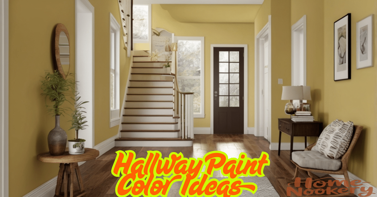
The often overlooked hallway is finally getting its moment in the spotlight. As we move through 2025, interior designers are reimagining these transitional spaces as opportunities for bold expression rather than merely functional thoroughfares. The humble hallway has become a canvas for creativity, a chance to make a statement before guests even reach your main living areas.
I’ve spent countless hours consulting with color specialists and design experts to bring you the most transformative hallway paint colors of 2025. These aren’t just random selections but carefully curated options that reflect both emerging trends and timeless appeal.
1. Moody Blues Take Center Stage
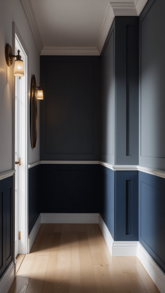
Deep, contemplative blues have surged in popularity this year. Navy has evolved from its traditional maritime associations to become a sophisticated neutral that works in virtually any hallway.
The trick is in how you pair it. Navy with crisp white trim creates a classic, almost nautical feel, while navy with brass accents feels luxuriously modern. I’ve seen incredible hallways where homeowners painted just the lower two-thirds in navy, leaving the top third and ceiling in a soft white for an effect that’s both grounding and expansive.
Designers are also exploring midnight blues with subtle purple undertones. These colors absorb light in the most fascinating way, creating spaces that feel mysteriously inviting rather than gloomy.
2. Earthy Terracottas Bring Warmth
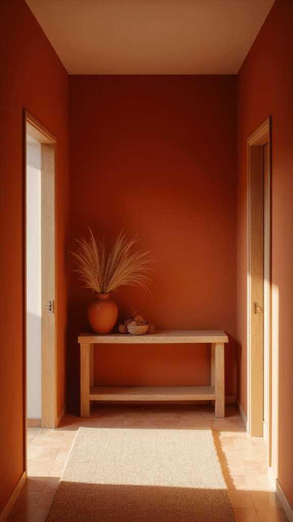
The earthy revolution continues with terracotta tones dominating many designer portfolios. These warm, rich hues create an instant sense of welcome in hallways of all sizes.
What’s surprising is how versatile they are. In sun-drenched hallways, terracotta almost glows, creating a vibrant energy. In darker spaces, it brings unexpected warmth without making the area feel smaller. I recntly worked with a client who paired a dusty terracotta with natural wood trim—the combination was absolutely breathtaking.
The beauty of these earths is their ability to connect interior spaces with the natural world, creating a subtle transition that feels organic and intentional.
3. Two-Tone Walls for Added Depth
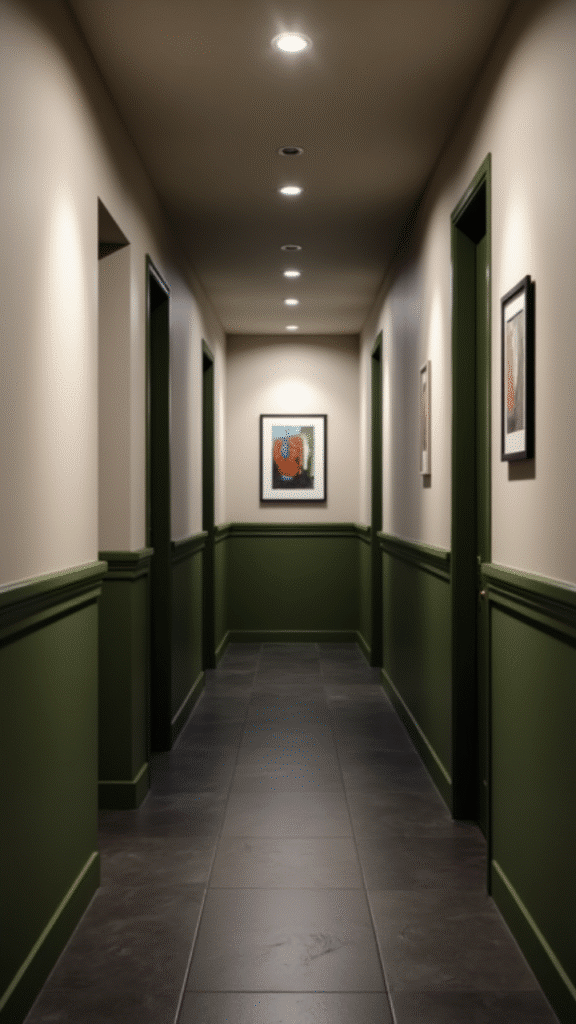
Forget the dated chair rail approach of decades past. Today’s two-tone walls are all about creating architectural interest where none exists.
The modern approach uses color blocking in unexpected ways. Imagine a hallway where color wraps around corners, creating a ribbon-like effect that draws the eye forward. Or hallways where the color change happens at varying heights along the corridor.
I’ve worked with homeowners who’ve used this technique to make short hallways feel longer and long hallways feel more proportionate. Its a game-changer for awkward spaces that previously felt like design challenges rather than opportunities.
4. Sage Green Creates Calm Transitions
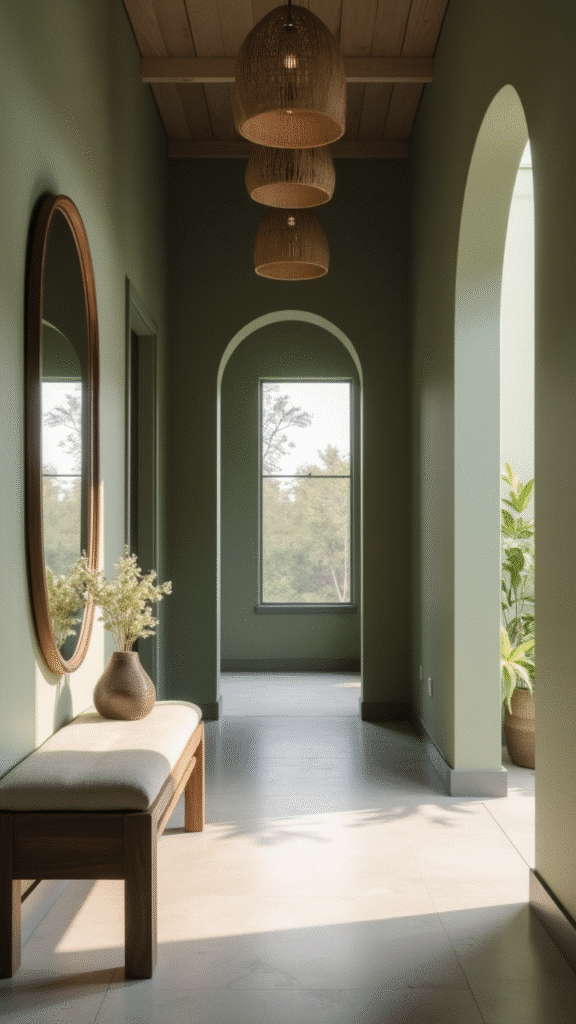
If there’s a color that defines 2025, it might be sage. This muted, sophisticated green has transcended trend status to become a new neutral in the designer’s palette.
What makes sage so perfect for hallways is its chameleon-like quality. It shifts subtly throughout the day as natural light changes, creating spaces that feel alive and responsive. One client described her sage hallway as “breathing with the house,” which perfectly captures its effect.
Sage plays beautifully with natural materials like rattan, jute, and unfinished woods, making it ideal for creating cohesive transitions between more boldly designed rooms.
5. Barely-There Pastels Expand Space
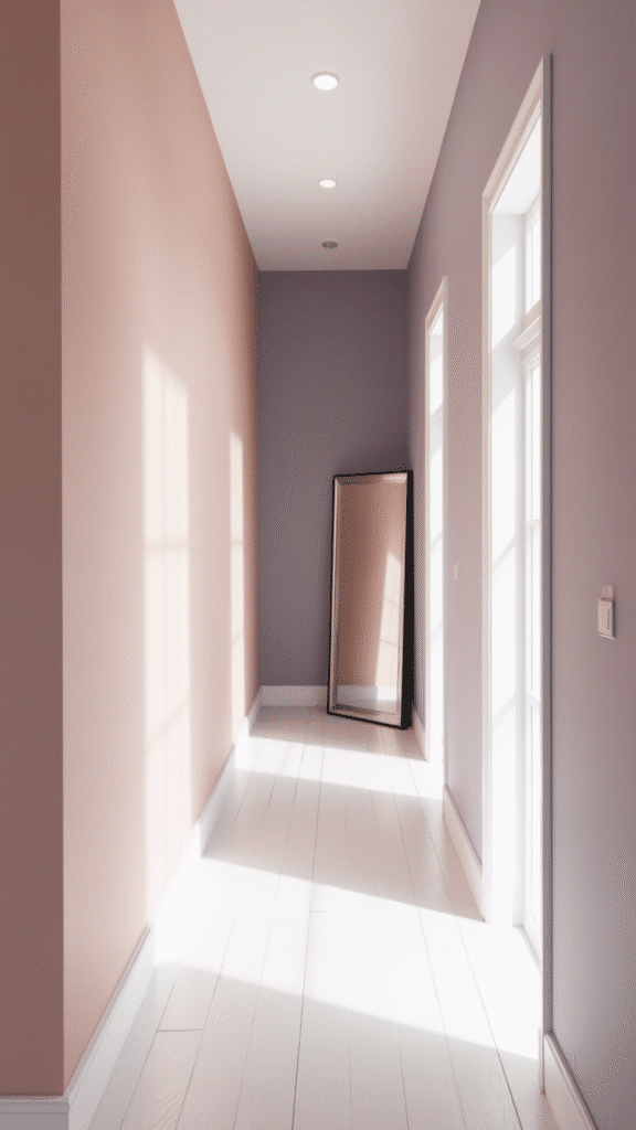
Ultra-pale pastels with just a whisper of color have become the secret weapon for dark or narrow hallways. These aren’t the baby blues and pinks of nurseries past but sophisticated, nearly-neutral shades with just enough pigment to create interest.
The most popular include blush tones with gray undertones, pale sage with a hint of blue, and lavender so light it reads as a warm neutral in certain lights. These colors reflect light brilliantly, making them perfect for windowless hallways or northern exposures.
I’ve seen these colors transform the most challenging spaces into airy, expansive-feeling corridors that seem to expand beyond their actual dimensions.
6. Bold Colors for Statement Hallways
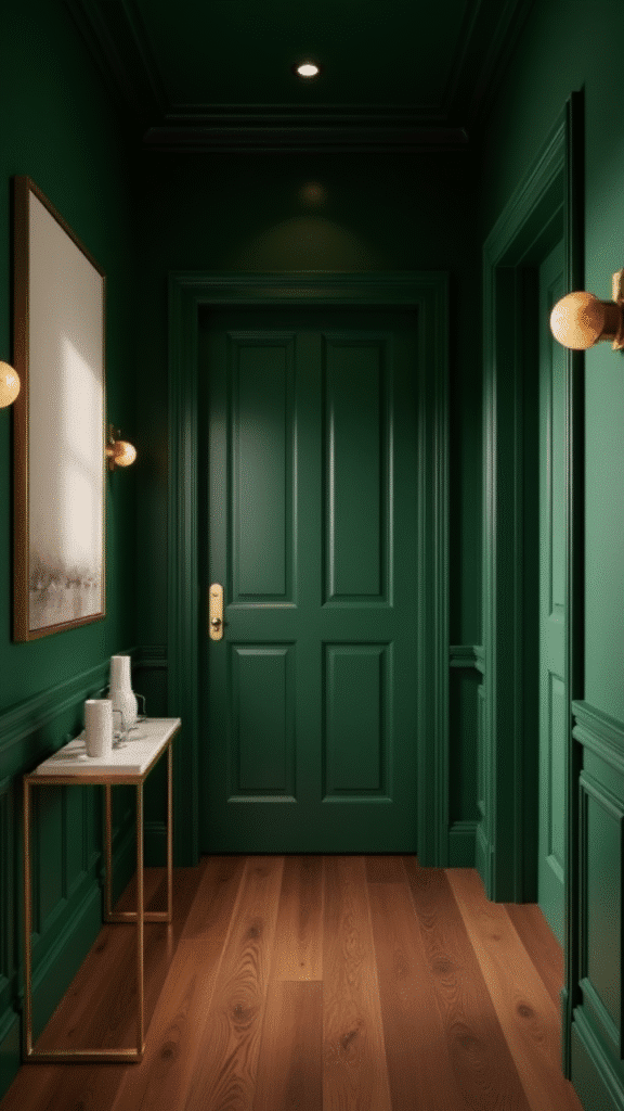
For the brave souls among us, 2025 brings permission to go bold where we once played safe. Hallways are increasingly seen as perfect opportunities for dramatic color statements that might overwhelm larger living spaces.
Inky charcoals, vibrant emeralds, and even saturated berries are making appearances in the most stylish homes. The trick to making these work is in the execution—pair them with minimal art, simple lighting fixtures, and let the color be the star.
One designer I spoke with called hallways “the perfect laboratory for color courage” since they’re spaces we pass through rather than live in. If you’ve been wanting to experiment with bold color, your hallway might be the perfct place to start.
7. Transform your living room with hallway paint colors 2025 and coastal-inspired Sherwin shades
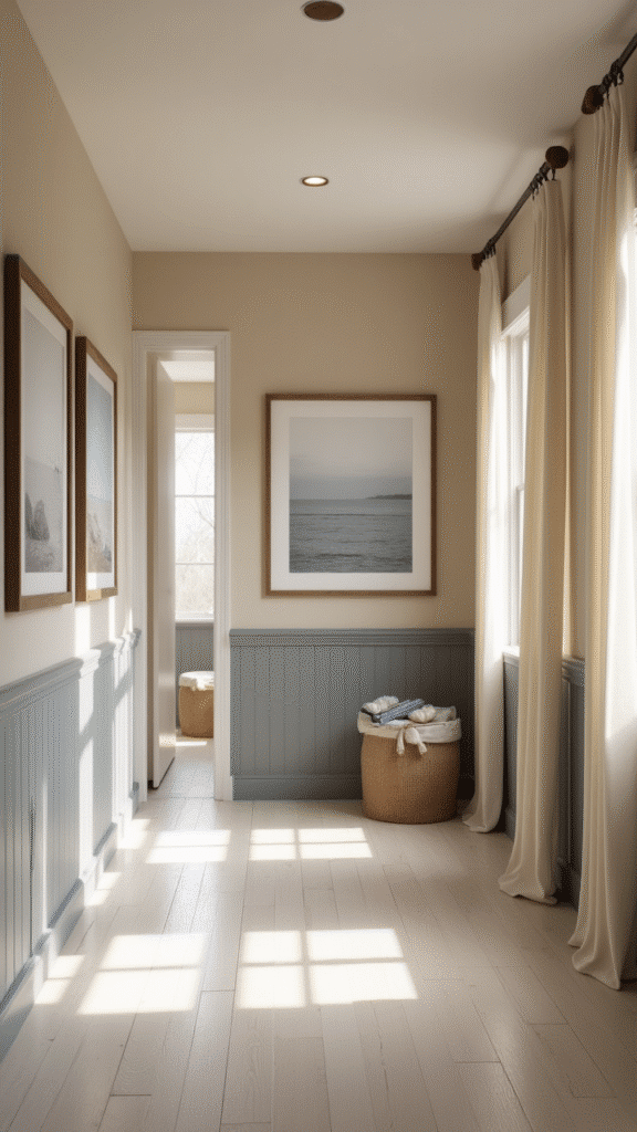
The boundaries between spaces are blurring in today’s homes. Forward-thinking designers are creating cohesive color stories that flow from hallways into adjacent living areas.
Coastal palettes have evolved far beyond nautical blues and whites. Today’s coastal-inspired colors include muted sage greens, sandy beiges with complex undertones, and stormy grays that evoke moody beaches. These colors create a sense of expansiveness and calm that’s perfectly suited to our increasingly hectic lives.
By extending hallway colors into living spaces—either as accent walls or as complementary tones—you create a visual rhythm that makes your entire home feel more intentionally designed.
8. Warm Whites Get Sophisticated
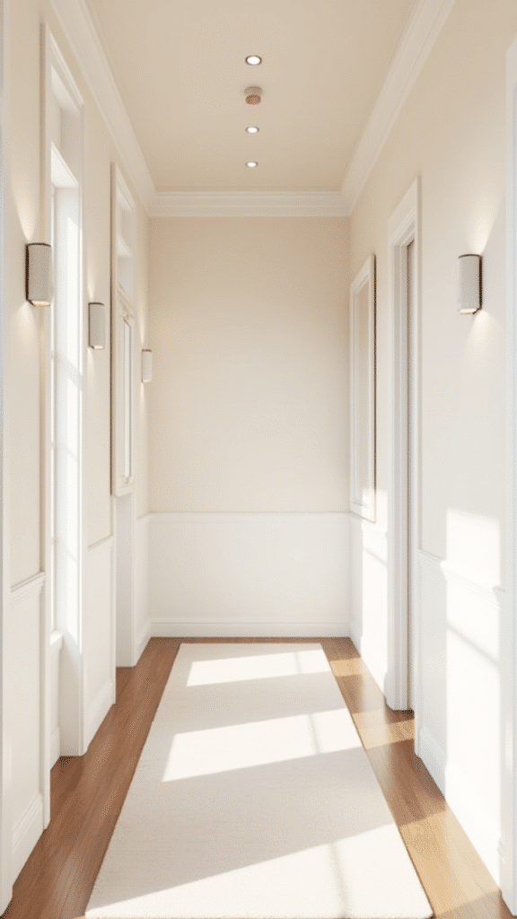
White hallways will never go out of style, but the crisp, clinical whites of the past have given way to warmer, more nuanced options. These aren’t your grandmother’s creamy yellowed whites, but sophisticated options with subtle undertones that add dimension.
Whites with the faintest hint of pink create welcoming warmth, while those with green undertones feel fresh and natural. The key is choosing a white that responds beautifully to your specific lighting conditions and complements adjacent rooms.
I’ve worked with clients who’ve used up to three slightly different whites in a single hallway—one for walls, another for trim, and a third for the ceiling—creating subtle layering that feels luxuriously thoughtful.
9. Charcoal and Black for Dramatic Effect
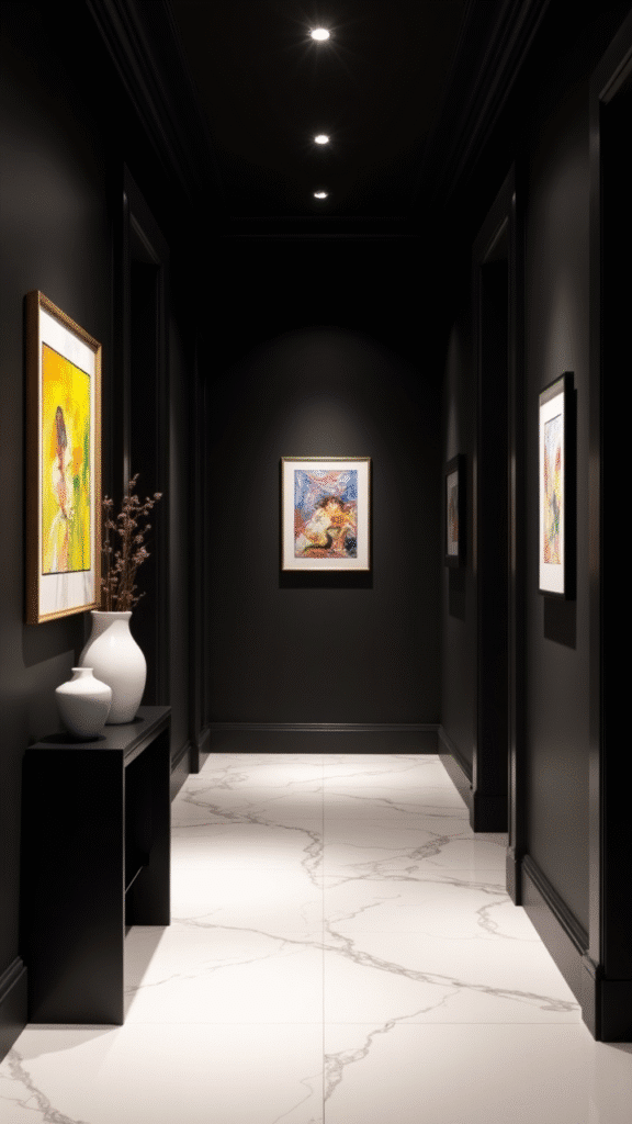
For homes with ample natural light, charcoal and even true black have become surprisingly popular choices. Rather than making spaces feel smaller, these dark hues can actually disguise the boundaries of a space, creating a sense of infinite depth.
The contrast between dark walls and light art or mirrors creates a gallery-like effect that showcases collections beautifully. I’ve seen stunning hallways where homeowners have gone completely dark—walls, ceiling, and trim—for an enveloping experience that feels both intimate and expansive.
These colors work especially well in transitional spaces between more neutrally colored rooms, creating dramatic pauses between quieter spaces.
10. Color Drenching Creates Cohesion
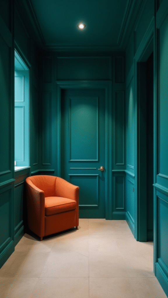
Perhaps the most dramatic trend of 2025 is color drenching—painting walls, trim, doors, and sometimes even ceilings in the same hue. This technique creates cocooning spaces that feel intentionally designed rather than accidental.
The effect varies dramatically depending on the color chosen. Soft neutrals create serene, womb-like spaces, while bolder hues make powerful statements. I’ve seen drenched hallways in everything from subtle greiges to vibrant teals, each creating its own unique atmosphere.
What’s particularly interesting about this technique is how it can actually make smaller spaces feel larger by eliminating the visual breaks of contrasting trim that can chop up a space.
11. Hallway Paint Colors 2025: Bold Trends, Modern Designs, and Creative Ideas for Stunning Spaces
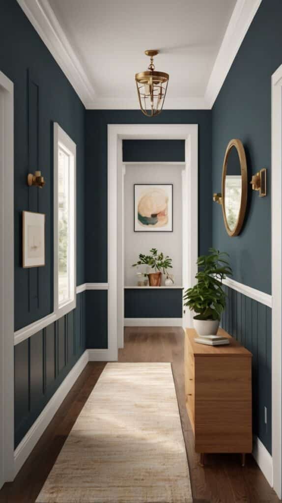
As we continue exploring the defining trends of 2025, it’s clear that hallways are becoming spaces for personal expression rather than merely functional connectors. The most innovative homes are using these areas to set the tone for the entire house.
Modern hallway designs embrace color as an architectural element, using it to define space, create rhythm, and establish mood. We’re seeing increasing experimentation with color placement—painting single walls, creating horizontal bands, or using color to highlight architectural features.
What makes these approaches truly successful is thoughtful consideration of how colors transition between spaces and how they interact with the specific quality of light in your home.
12. Jewel Tones Add Unexpected Luxury
Emerald green, sapphire blue, and amethyst purple have emerged as surprisingly versatile choices for hallways seeking a touch of luxury. These rich, saturated hues bring undeniable presence to otherwise unremarkable spaces.
The key to making jewel tones work in hallways is balancing their intensity with plenty of neutral elements. Natural wood floors, simple white trim, or neutral runners create necessary breathing room. I’ve worked with several clients who were initially hesitant about jewel tones but were absolutely thrilled with the results.
These colors pair beautifully with metallic accents—brass picture frames, gold-toned light fixtures, or silver mirror frames create magical combinations that feel both timeless and thoroughly contemporary.
13. Nature-Inspired Greens Bring the Outdoors In
Beyond sage, the entire spectrum of natural greens is having a moment in hallway design. From mossy olive tones to soft celadon, these colors create an instant connection to the natural world even in the most urban settings.
What makes these greens so adaptable is their inherent neutrality—green is, after all, nature’s neutral. They pair beautifully with woods of all tones, natural fibers, and other earth-inspired colors. One designer I interviewed uses the term “visual ecosystem” to describe how these greens create cohesive environments.
In homes with views of gardens or natural landscapes, these greens create seamless transitions between indoor and outdoor spaces, blurring boundaries in the most pleasing way.
14. Muted Corals Add Unexpected Warmth
While millennial pink has faded from trend reports, its more sophisticated cousin—muted coral—has stepped into the spotlight. These complex pinks with orange undertones bring unexpected warmth to spaces that might otherwise feel sterile.
What’s particularly interesting about these colors is how they interact with changing light throughout the day. Morning sun brings out their warmth, while evening light emphasizes their complexity. They’re especially effective in hallways with eastern or western exposures where they respond dramatically to shifting daylight.
I’ve seen these colors paired with everything from crisp whites for a modern look to rich woods for a more traditional feel. Their versatility makes them surprisingly easy to integrate into existing design schemes.
15. Mindful Neutrals Create Calm
In our increasingly overstimulated world, some homeowners are opting for carefully considered neutrals that create moments of visual rest. These aren’t the flat beiges of decades past but complex, layered neutrals with subtle undertones that shift throughout the day.
Warm grays with hints of green, taupes with purple undertones, and soft stone colors create spaces that feel both grounded and ethereal. These colors work particularly well in hallways connecting more vividly colored rooms, creating breathing space between more intense design moments.
I’ve noticed that these neutrals are especially popular in homes where the architecture itself is distinctive—they allow beautiful mouldings, interesting doorways, or unique light fixtures to take center stage.
Finding Your Perfect Hallway Color
With so many exciting options, how do you choose the right color for your particular hallway? The answer lies in thoughtful consideration of several factors unique to your space.
First, consider your hallway’s natural light. North-facing hallways benefit from warmer tones that counteract cool light, while south-facing spaces can handle cooler hues without feeling chilly. East-facing hallways receive warm morning light and cool afternoon shade—colors will shift dramatically throughout the day.
Next, think about adjacnt rooms. Your hallway should create a thoughtful transition between spaces rather than an abrupt change. This doesn’t mean matching colors exactly, but ensuring they speak to each other in a meaningful way.
Finally, consider the mood you want to create. Hallways are perfect opportunities to set the emotional tone for your home. Do you want to create energy and excitement? Calm and tranquility? Dramatic luxury? Your color choice should support these emotional goals.
The hallway colors of 2025 offer something for every design sensibility, from the boldly experimental to the quietly sophisticated. By approaching your hallway as an opportunity rather than an afterthought, you’ll create a home that feels intentionally designed from the moment you open the front door.

Mariana is the founder and voice behind Home Nookery, a curated blog dedicated to home design, décor inspiration, and cozy living. With a passion for creating beautiful, functional spaces, Mariana shares practical tips, styling ideas, and thoughtful insights to help readers turn their houses into homes. Whether you’re redesigning a room or just adding a touch of charm, she’s here to guide you with creativity and heart.
